Extension methods
Wyliodrin STUDIO enables customization, which means that you may add plugins to extend its features. Plugins may register different components, like buttons specifically designed for devices, workspace tabs, status buttons, toolbar buttons or menus.
Here is a list of plugins of this type, registered at this moment in Wyliodrin STUDIO:
Toolbar Buttons
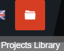
These buttons are located in the toolbar, on the top of the main window. A toolbar button is an element that will perform different actions when clicked, according to the component that is relied to it. For example, these buttons may open dialogs that require user inputs.
In order to create this type of buttons, we implemented the registerToolbarButton function:
-
registerToolbarButton(name, priority, action, iconURL, options)¶ This function will register a new button in the toolbar.
Each toolbar button has a translatable name, that will be displayed under it on mouse hover, a priority, which refers to the position of an element in the toolbar buttons list, an action, representing the content that will be opened when the button is selected, an icon that will represent the actual symbol of the button and on which the user will be able to click, and aditional options, that will authorize or will block the user access, depending on their value.
The default value of these options is () => return true, which means the toolbar button will be visible and will allow user access, but it can be customized at the moment of the registration of one element.
If the value of enabled will be changed to another function, the name of the toolbar button will still be visible in the list of all toolbar buttons, but it won’t permit any user action, because the button will not become usable until the return value of the function will be true.
If the value of the visible option is changed to another function, the name of the toolbar button will not appear in the list with all toolbar buttons until the return value of the function will become true; in this case, when the element is visible, it becomes automatically enabled.
Arguments: - name (string) – the name/id of the toolbar button
- priority (number) – the priority of the tab, lower is to the left
- action (function) – the function to run when clicked
- iconURL (string) – the relative path to the image assigned
- options (Object) – additional options, like visible or enabled; the button is available for user interaction according to the value of these options
Returns: disposable – - an item that may be disposed
Examples:
let time = new Date();

registerToolbarButton('TOOLBAR_BUTTON', 10, () => showNotification('You created a toolbar button!'), 'plugins/projects/projects/data/img/icons/button.svg', {
          visible() {
                  return time.getHours() > 8;
          }
});
we register a button having the translation key ‘TOOLBAR_BUTTON’, the priority 10, that on click will pop up a notification with the content: “You created a toolbar button”. We need to specify the relative path to the image related to the button.
This function also modifies the default value of the visible additional options, making the button visible for the user only after 8 AM.

Tabs
The tabs are components of our application and accomplish various functions that help you handling your projects and interacting with the device that is connected to Wyliodrin STUDIO.
They are integrated with the registerTab function:
-
registerTab(name, priority, component, options)¶ This function will register a new tab in the workspace.
Each tab has a title, that will be displayed in the workspace, a priority, which refers to the position of a tab in the list of tabs, a component, representing the actual content and funtionality of the tab, and aditional options, that will authorize or will block the user access, depending on their value.
The default value of these options is () => return true, which means the menu item will be visible and will allow user access, but it can be customized at the moment of the registration of one element.
If the value of enabled will be changed to another function, the name of the menu item will still be visible in the list of all menu items, but it won’t permit any user action, because the item will not become usable until the return value of the function will be true.
If the value of the visible option is changed to another function, the name of the menu item will not appear in the list with all menu items until the return value of the function will become true; in this case, when the element is visible, it becomes automatically enabled.
Arguments: - name (string) – the translation ID of the title of the tab
- priority (number) – the priority of the tab, lower is to the left
- component (Vue) – the Vue component to display
- options (options) – additional options, like visible or enabled; the tab is available for user interaction according to the value of these options;
Returns: disposable – an item that may be disposed {
disposable()}Examples:
let time = new Date();

registerTab('PROJECT_NOTEBOOK', 300, Notebook, {
          enabled () {
                  return time.getHours() > 8;
          }
});
A list of the currently existing tabs:

The tabs are registered in the workspace plugin. They can be accessed only if their “enabled” property is true, which means that you have to validate a certain condition: have an opened project or be connected to a device.
DeviceTool Buttons
These buttons are visible only when a device is connected and they can be different according to the device type.
We added them in the DeviceTools.vue component, and this is how they look like:

They were previously registered using the registerDeviceToolButton function:
-
registerDeviceToolButton(deviceType, name, priority, action, iconURL, options)¶ This function is used to register a new device tool button, specific for every device type.
For example, when a Raspberry Pi board is connected, the following buttons become available: Run, Stop, TaskManager, PackageManager, NetworkManager.
Each device button require a deviceType, to know for which type of device we are registering the customized button, it has a translatable name, that will be displayed under it on mouse hover, a priority, which refers to the position of an element in the device buttons list, an action, representing the content that will be opened when the button is selected, an icon that will be the actual symbol of the button and on which the user will be able to click, and aditional options, that will authorize or will block the user access, depending on their value.
The default value of these options is () => return true, which means the device button will be visible and will allow user access, but it can be customized at the moment of the registration of one element.
If the value of enabled will be changed to another function, the name of the device button will still be visible in the list of all device buttons, but it won’t permit any user action, because the button will not become usable until the return value of the function will be true.
If the value of the visible option is changed to another function, the name of the device button will not appear in the list with all device buttons until the return value of the function will become true; in this case, when the element is visible, it becomes automatically enabled.
Arguments: - deviceType (string) – the device driver type the button is for
- name (string) – the name/id of the menu item
- priority (number) – the priority of the tab, lower is to the left
- action (function) – the function to run when clicked
- iconURL (string) – the relative path to the image assigned
- options (Object) – additional options, like visible or enabled; the button is available for user interaction according to the value of these options
Returns: disposable – - an item that may be disposed
Examples:
let time = new Date();

registerDeviceToolBotton('RUN', 10,  => showNotification('You clicked the Run button!'),
          'plugins/studio/workspace/data/img/icons/button.svg', {
          visible() {
                  return time.getHours() > 8;
          }
});
Here, we registered a device tool button having the translation key ‘DEVICETOOL_BUTTON’, the priority 10, that on click will pop up a notification with the content: “You created a device tool button!”.
The button will be visible for an user only after 8 AM.
Status Buttons
The last component of the workspace is represented by the status buttons: Console and MQTT. A status button is an element that will perform different actions when clicked, according to the component that is relied to it. For example, these buttons may open terminals or interfaces that require user inputs.
They are created using the registerStatusButton function.

-
registerStatusButton(name, priority, component, iconURL, options)¶ This function will register a new button in the status bar that is displayed in the bottom of the window.
Each status button has a translatable name, that will be displayed under it on mouse hover, a priority, which refers to the position of an element in the status buttons list, a component, representing the content that will be shown when the button is clicked, an icon that will represent the actual symbol of the button and on which the user will be able to click, and aditional options, that will authorize or will block the user access, depending on their value.
The default value of these options is () => return true, which means the status button will be visible and will allow user access, but it can be customized at the moment of the registration of one element.
If the value of enabled will be changed to another function, the name of the status button will still be visible in the list of all status buttons, but it won’t permit any user action, because the button will not become usable until the return value of the function will be true.
If the value of the visible option is changed to another function, the name of the status button will not appear in the list with all status buttons until the return value of the function will become true; in this case, when the element is visible, it becomes automatically enabled.
The statusButtons registered at the moment can open the Console and the Mqtt server interface.
Arguments: - name (string) – the name/id of the menu item
- priority (number) – the priority of the tab, lower is to the left
- component (Vue) – the Vue component to display
- iconURL (string) – the relative path to the image assigned
- options (Object) – additional options, like visible or enabled; the button is available for user interaction according to the value of these options
Returns: disposable – - an item that may be disposed
Examples:
registerStatusButton('CONSOLE', 1, Console, 'plugins/studio/console/data/img/icons/terminal-icon.svg');
The Console button opens a console similar to the shell, while the MQTT button opens an interface where you can choose the port where the MQTT server will be opened (the default port is 1883). MQTT is a publish-subscribe-based messaging protocol.
Language
The language button is included in the LanguageMenu.vue component and its corresponding image, a flag, changes dynamically according to the selected language.

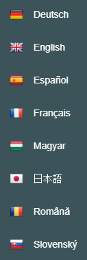
Here’s a list with all the languages available at this moment:

When a language is selected from the list, the setLanguage function is called, which is using the internationalization (i18n) process, and the new language is updated, meaning that all the keys will be translated. More details about the translation function are discussed here.

