Dialogs and Notifications
In the “workspace” plugin you will find, additionally to the functions presented in the API sections, some functions designed to create and display some customized pop-ups, like dialogs, prompts and notifications.
Dialogs
A dialog is a component that informs users about a specific task and may contain important informations, require decisions, or involve multiple actions or inputs. It can usually be used to collect data from the user.
-
showDialog(title, component, options, buttons, values={})¶ This function shows a dialog that can contain informations about an application component or that can require user actions.
The dialog will have a translatable title, displayed on the top of the box, a Vue component specifically designed to collect the required data from the user, additional options and buttons to customize the dialog window, and the values option that allow the translation of some system variables the user is working with.
Arguments: - title (string|object) – the title of the dialog window
- component (Vue) – the Vue component to display
- options (Object) – additional like width
- buttons (Array.<Object>) – the array of buttons to display
- values (Object) – values to insert into the translatable text
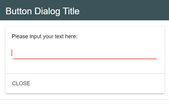
For example, having the Simple plugin created, let’s say that when the button is clicked, you want to open a simple dialog with an input text area and a “Close” button. The content of the ButtonDialog.vue component will be:
<template>
        <v-card>
                <v-card-text>
                        {{$t('BUTTON_EXAMPLE_INPUT_TEXT')}}
                        <v-text-field></v-text-field>
                </v-card-text>

                <v-card-actions>
                        <v-btn text @click="close">Close</v-btn>
                </v-card-actions>
        </v-card>
</template>
Inside the script section, you will define the methods that your component needs:
export default {
        name: 'ButtonDialog',
        data() {
                return {

                }
        },
        methods: {
                close() {
                        this.$root.$emit ('submit', undefined);
                }
        }
}
The index.js file will have the following structure:
import ButtonDialog from './views/ButtonDialog.vue';

let studio = null;

export function setup(options, imports, register)
{
        studio = imports;

        /* Register a toolbar button that on click will reveal a dialog with the specified title, image and component */
        studio.workspace.registerToolbarButton ('BUTTON_EXAMPLE_NAME', 20,
                () => studio.workspace.showDialog ('BUTTON_EXAMPLE_DIALOG_TITLE', ButtonDialog),
                'plugins/button.example/data/img/button.png');

        register(null, {
                button_example: button_example
        });
}
The title parameter is not mandatory when you call the showDialog function, because you can choose the title of a dialog box within the Vue file that designs this component.
For example:
<template>
        <v-card>
                <v-card-title>
                        {{ $t('BUTTON_EXAMPLE_DIALOG_TITLE') }}
                </v-card-title>

                <v-card-text>
                        {{$t('BUTTON_EXAMPLE_INPUT_TEXT')}}
                        <v-text-field></v-text-field>
                </v-card-text>

                <v-card-actions>
                        <v-btn text @click="close">Close</v-btn>
                </v-card-actions>
        </v-card>
</template>
The script section will have the same structure as before, while within the index.js file you will have to register your button as it follows:
studio.workspace.registerToolbarButton ('BUTTON_EXAMPLE_NAME', 20,
        () => studio.workspace.showDialog (ButtonDialog),
        'plugins/button.example/data/img/button.png');
As you can notice, the showDialog function will use only the ButtonDialog component as parameter.
In both situations the result will be the same:
Prompts
A prompt is actually a dialog box that requires a user decision. A prompt box is often used if you want the user to input a value before entering a page, for example write a text or click on a button that will perform a certain action.
-
showPrompt(title, question, original, action, value={})¶ This function shows a customized prompt that waits for user input and collects data.
A prompt has a title, that is located at the top of the box and it indicates the purpose of the prompt, a question, representing the requirement addressed to users, an original value contained in the input area, an action to be performed, and the values option that allow the translation of some system variables the user is working with.
Arguments: - title (string) – the translatable title of the prompt to be displayed
- question (string) – the translatable question of the prompt to be displayed
- original (string) – the original translatable content of the input area
- action (Object) – the action performed
- value (Object) – values to insert into the translatable text
Examples:
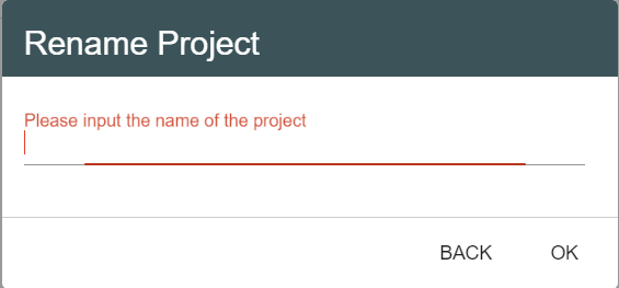
showPrompt('PROJECT_RENAME_PROJECT', 'PROJECT_NAME_PROMPT','');
This prompt is used to rename a project. The ‘PROJECT_RENAME_PROJECT’ is a translatable key string that corresponds to the title of the prompt (Rename Project) and ‘PROJECT_NAME_PROMPT’ represents the question or the statement addressed to the user (Please input the name of the project). Both key strings have to be included within the translations files.
The showPrompt function will return the value inputted by the user if he will click on OK and null otherwise, so that you can perform different actions depending on its answer.
-
showConfirmationPrompt(title, question, values={})¶ This function shows a customized prompt containing a simple question and waiting for a Yes/No response.
This prompt also has a title, that is located at the top of the box and it indicates the purpose of the prompt, a question, addressed to users in order to confirm an action that will be performed, and the values option that allow the translation of some system variables the user is working with.
Arguments: - title (string) – the translatable title of the prompt to be displayed
- question (string) – the translatable question of the prompt to be displayed
- values (Object) – values to insert into the translatable text
Examples:
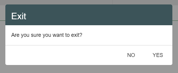
showConfirmationPrompt('EXIT', 'WORKSPACE_TOOLBAR_EXIT_QUESTION');
Notifications
The notifications are simple pop-ups that inform the user about unauthorized actions, required operations or system processes.
The possible types for a notification are: info, success, and warning, and each type has a distinct color.
-
showNotification(text, values={}, type, timeout=6000)¶ This function shows a notification that will inform the user about the current application state.
The notification will have a text content, that will be translated according to the current language of the program, but it can also contain the name of one system variable the user is working with. This variable is included in the values object in order to be translated, because its value can change dynamically. Each notification also has a type, that will update the color of the notification box, and a timeout to be visible for the user, its default value being 6 seconds.
Arguments: - text (string) – the translatable ID of the text to be displayed
- values (Object) – values to insert into the translatable text
- type (string) – the notification type: info/success/warning
- timeout (number) – timeout until the notification is dismissed automatically (0 for never)
Examples:
studio.workspace.showNotification ('TRANSLATED_TEXT_ID', {title: 'the title'}, 'success', 5000);
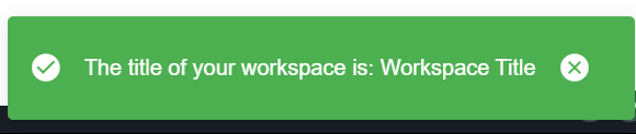
In this situation, “title” is a variable that represents the title of the notification and will be included in the messages-ln.json translation files as it follows:
{
        "TRANSLATED_TEXT_ID": {
                "message": "The title of your workspace is: {title}",
                "description": "Text of the notification the user created."
        }
}
title will be the actual name of your workspace, in this example: Workspace Title.
-
showError(text, value={}, timeout=6000)¶ This function sends an error notification in the application, when the user is trying to perform an unauthorized action.
The error notification will have a text content, that will be translated according to the current language of the program, but it can also contain the name of one system variable the user is working with. This variable is included in the values object in order to be translated, because its value can change dynamically, and a timeout to be visible for the user, its default value being 6 seconds.. In opposition to a basic notification, the default type is error.
Arguments: - text (string) – the translatable ID of the text to be displayed
- value (Object) – values to insert into the translatable text
- timeout (number) – timeout until the notification is dismissed automatically (0 for never)
Examples:
studio.workspace.showError ('TRANSLATED_TEXT_ID', {title: 'the title'}, 5000);
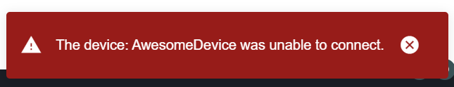
Similar to showNotification, “title” is a variable that represents the title of the error notification and will be included in the messages-ln.json translation files as it follows:
{
        "TRANSLATED_TEXT_ID": {
                "message": "The device: {title} was unable to connect.",
                "description": "Text of the notification the user created."
        }
}
title will be the name of the device you are trying to connect, in this example: AwesomeDevice.